Daniel Rebour - Illustrator. Who's your favourite cycling illustrator/Cartoonist?

fantastic. not only the artwork, but subjects, too.

Q: anyone know the reason behind shaping the front fender as in post #98, figure #9?

looks snazzy, but i didn't know if it's to represent something other than a little panache.

thanks
I imagine the ridge is so you can mount things on it, like lighting, racks, speedometers and have a little extra strength from the rib. Also the bolt and nut would not be protruding on the underside.
 
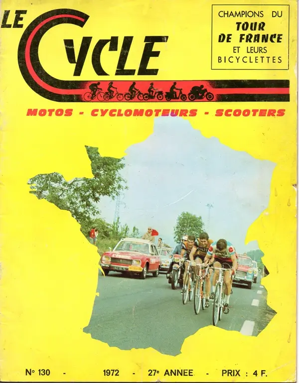
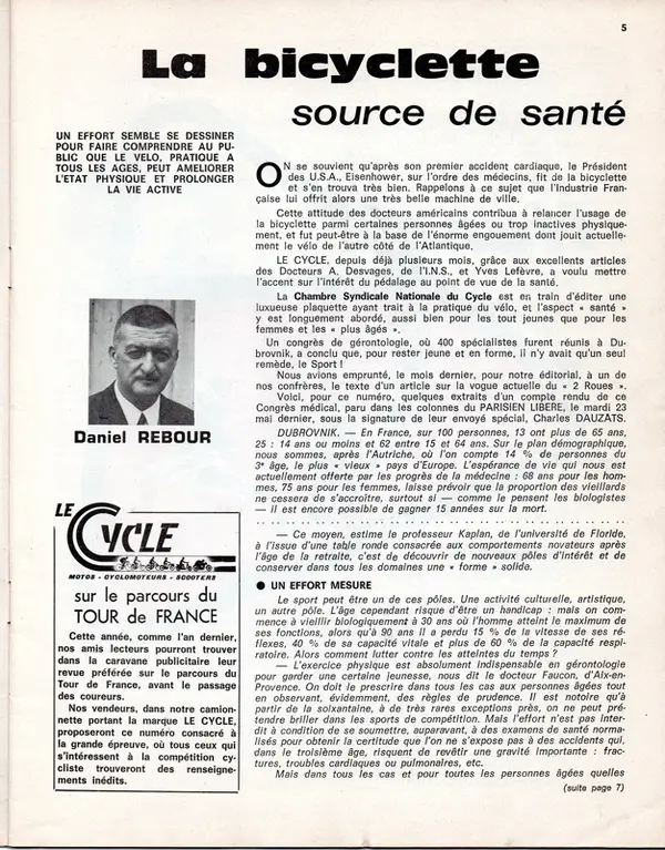
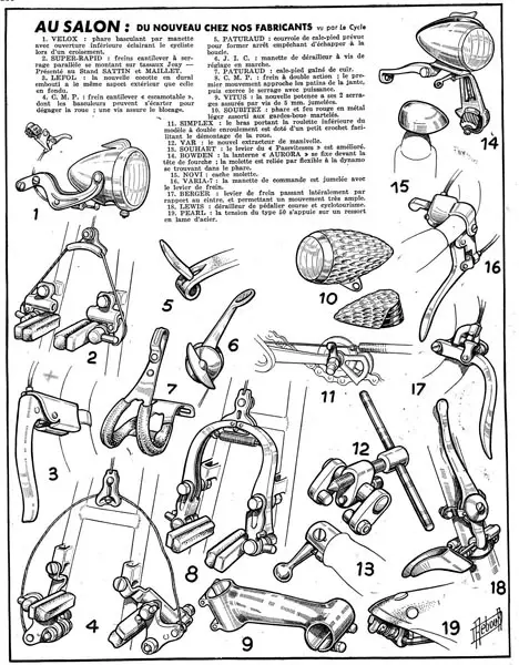
In my stash of old catalogues and brochures I have this publication from 1972. I'm presuming it is mainly a trade magazine and there are a lot of Rebour illustrations used in the text and adverts. I'll be posting a selection of them as there are to many to post at the same time. This is the cover and the first bit of editorial written by the man himself - along with a photo.

Le Cycle cover A.jpg

Le Cycle editorial A.jpg

All those of a certain age take note of what he says..............................

And Milremo advert, a brand I thought was British but being advertised in France by Andre Bertin who was Ron Kitching's partner in the brand.;

Le Cycle Milremo ad.jpg

Lots more pages to come!
 
In my stash of old catalogues and brochures I have this publication from 1972. I'm presuming it is mainly a trade magazine and there are a lot of Rebour illustrations used in the text and adverts. I'll be posting a selection of them as there are to many to post at the same time. This is the cover and the first bit of editorial written by the man himself - along with a photo.

View attachment 910334

View attachment 910335

All those of a certain age take note of what he says..............................

And Milremo advert, a brand I thought was British but being advertised in France by Andre Bertin who was Ron Kitching's partner in the brand.;

View attachment 910336

Lots more pages to come!
That's nice! It was a monthly magazine for mostly cycle tourists and randoneeurs. They featured race bikes also but their focus was predominantly touring and fast tourers. Rebour was initially employed just as a lowly, badly paid illustrator but became I suppose a sort of partner in the business because of the quality of his work (and the necessity).

Colour plates for magazines were eye wateringly expensive in the era, so black and white and line drawings were the order of the day.
 
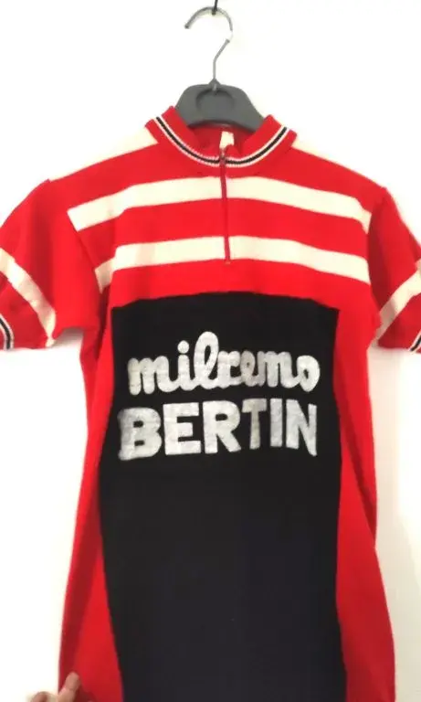
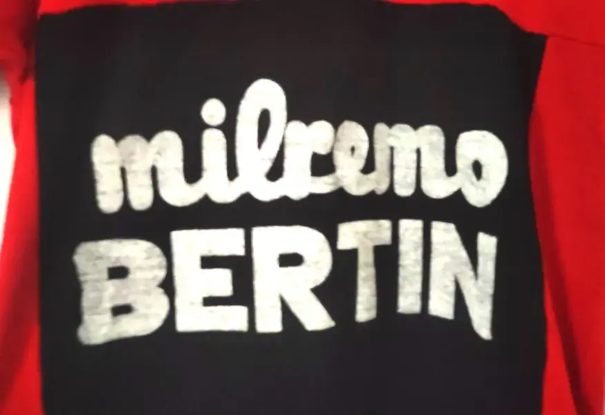
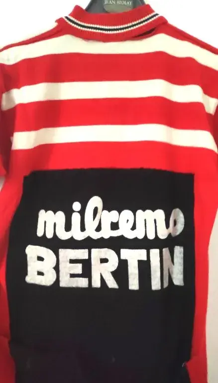
Ib have a Milremo Bertin jersey, which I suppose is kinda rare. 😵
 

Attachments

  • IMG_20241214_53765.jpg
    IMG_20241214_53765.jpg
    32.9 KB · Views: 0
  • IMG_20241214_52160.jpg
    IMG_20241214_52160.jpg
    56.7 KB · Views: 0
  • IMG_20241214_49727.jpg
    IMG_20241214_49727.jpg
    37.5 KB · Views: 0
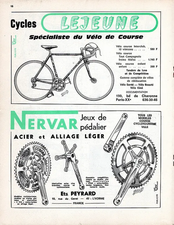
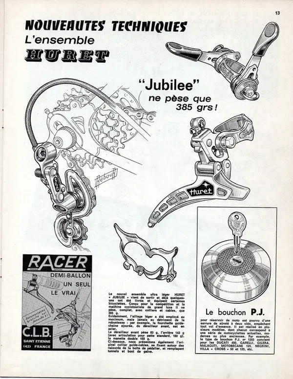
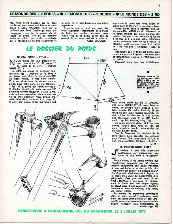
A couple more for your delectation (whatever that means! 😇)

Le Cycle page 4.A.jpg

Le Cycle page 5.A.jpg

Le Cycle page 6.A.jpg

A couple of interesting (to me anyway) points in the above -

The prices of the Lejeune bikes - fitted with Campag not Simplex etc..

The 'interesting' BB cable guide and the fuel cap drawing (seems Daniel would draw anything for a fee!)

The weights quoted for a frame (Vitus tubing of course) - and no mention of angles in the design only seat tube 'layback'.

More to come:D
 
Back
Top