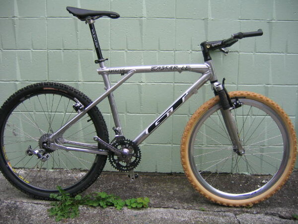
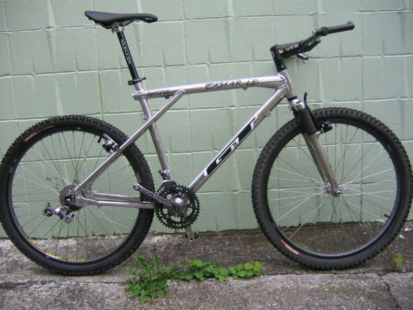
Zaskar LE - looks wrong but cant quite put my finger on it??

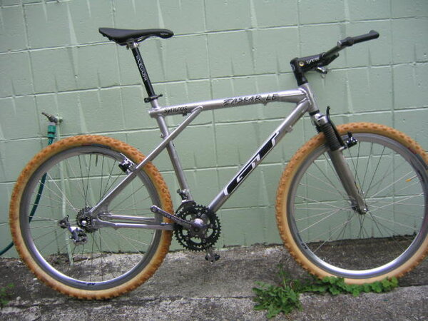
okay - took some side on photos - with chainrings and also with huge EGS shifter removed.

tried the different coloured tyres from my klein too

what do you think????

i think it looks a bit better
 

Attachments

  • IMG_0055.JPG
    IMG_0055.JPG
    53.6 KB · Views: 1,703
  • IMG_0054.JPG
    IMG_0054.JPG
    54.1 KB · Views: 1,703
  • IMG_0053.JPG
    IMG_0053.JPG
    56.2 KB · Views: 1,703
hmmm, the only thing that i don't like about your bike is the headset. looks like one of those modern integrated ones. apart from that its a nice setup.
judys would look cool on it
 
MAXTHEROTTI":380b7ca3 said:
i prefer the black tyres to be honest chap :?
maybe try some irc tyres for the redish side wall
or conti gumwall,s?


rob

i agree - but looked 'funny' withe the black sidewalls and black rims - have some panaracer amberwalls coming - they should be fine!!!
 
Inigo Montoya":325a58c0 said:
hmmm, the only thing that i don't like about your bike is the headset. looks like one of those modern integrated ones. apart from that its a nice setup.
judys would look cool on it

it is a bit modern but i had it lying around until i can afford something more suitabe ;)
 
Crayons":1t741rzo said:
Much better mate – for what it's worth, I like the black tyres, makes the bike look tougher.

yeah i reckon the amber walls will be perfect

the steerer needs trimming - the seatpost is slighly too high and the saddle can move back a little too but much happier with the rings on it
 
Is it a large frame?

Nothing that can be changed, but it looks very empty between the rear wheel and the top tube/seat tube junction.
Might look better with some cables to fill in a bit

Think the problem visually is its very tall from BB to Saddle which makes it look very upright and bikes tend to look better more streamlined.
Perhaps drop the saddle a bit (for photo purposes) and lose some spacers and that will bring it all down a bit

Don't think the background in the new pics helps either, very austere

Nothing wrong with that bike though :D and nice to see a more monochrome build after that Purple haze recently
 
I'd say keep it monochrome with just the smallest bit of colour like ano chain ring bolts, something like that.
 
Huntso":hlpdx6ee said:
Is it a large frame?

Nothing that can be changed, but it looks very empty between the rear wheel and the top tube/seat tube junction.
Might look better with some cables to fill in a bit

Think the problem visually is its very tall from BB to Saddle which makes it look very upright and bikes tend to look better more streamlined.
Perhaps drop the saddle a bit (for photo purposes) and lose some spacers and that will bring it all down a bit

Don't think the background in the new pics helps either, very austere

Nothing wrong with that bike though :D and nice to see a more monochrome build after that Purple haze recently

mate - the photodoesnt even tell half the story!!! just moved into a house that has been painted what is now referred to as "empty 80's swimming pool green"

it will be going soon :LOL:
 

Latest posts

Back
Top