You are using an out of date browser. It may not display this or other websites correctly.
You should upgrade or use an alternative browser.
You should upgrade or use an alternative browser.
MacRetro chat and rides thread
- Thread starter kaiser
- Start date
- Feedback
- View
Looking good show us a whole bike picture you tease.
- Feedback
- View
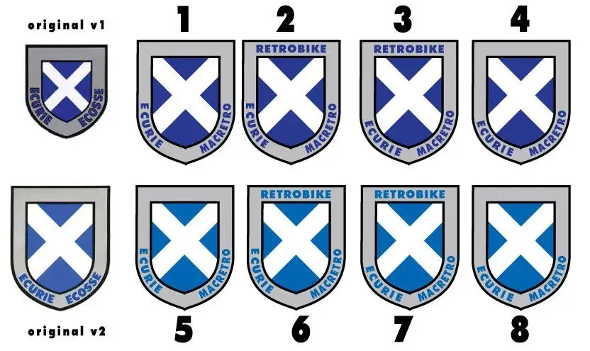
3 for me.
I'd say no1 is a good bet. Seeing as youse lot are admitting to losing your retro mojo, maybe kit that has no mention of Retrobike is the better choice. You can mince about with your moderns without having to explain 'my other bike is a retrobike' blah blah. Also looks nearer the original Ecurie logo which is 'the baws'.
Si
Si
Dr S":1bqyz1ip said:I'd say no1 is a good bet. Seeing as youse lot are admitting to losing your retro mojo, maybe kit that has no mention of Retrobike is the better choice. You can mince about with your moderns without having to explain 'my other bike is a retrobike' blah blah. Also looks nearer the original Ecurie logo which is 'the baws'.
Si
I just though we might need Retrobike on it, to save explaining what ecurie macretro actually meant to all you southerners when you eventually meet us on the other side of the finish line.
I think 3 looks lopsided, I didn't think anyone would pick any of those ones but did them as it is closer to the second original design.
- Feedback
- View
Dr S":3clo5ung said:BTW, top work there TK.
@Gazz, don't you think 3 looks lobsided? It looks like then youdont get yer brake levers level :?
Yeah crackin work and now you mention it si, 2 is better.
Similar threads
- Locked
- Replies
- 80
- Views
- 16K
- Locked
- Replies
- 3
- Views
- 53K
- Locked
- Replies
- 0
- Views
- 7K
- Replies
- 0
- Views
- 1K
