90 Orange Prestige

Re:

Yes, yes it did. After I'd travelled to pick it up it was a bit of a disappointment, considering the description, but utimately I wanted it for the frame/fork.

Almost everything on it was knackered, the only thing I've was able to salvage from it was the seatpost which I had to soak to eat the rust off (its on my Marin BVSE now) and the 9spd shifter/lever.

Luckily it does look like it'll ever look that bad again!
 
Re:

Haha, I stumbled upon the ebay listing via a thread on here and realised it was the same frameset so copied the pic's for reference.
 
I'm pulling up a stool for this as i'm real eager to see this get the attention it's been waiting for :p .
 
Re:

Well better show some progress Muddy Paw, don't want you waiting round for ages :LOL: .

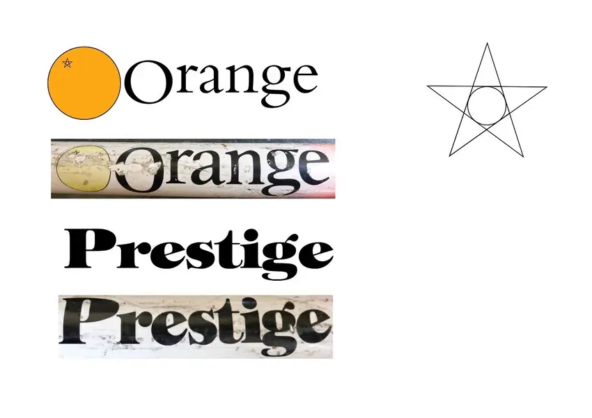
I've made a wee bit of progress with the decals, still not there but it's a good start I think. After a bit of research using some online font finders I managed to find a reasonable match for the decals as a starting point. I've matched the Orange logo, with a bit of trigonometry to get the stalk detail right :?
 

Attachments

  • Progress 1.jpg
    Progress 1.jpg
    76.4 KB · Views: 804
That's looking pretty close mate infact you'd probably get away with it but their again just like you i'd not be happy until it was at least 98% correct ..
 
Re:

Good work on the decals! If I were you I'd just concentrate on the 'Prestige' as Gil has on file ones that will be correct for the others.
 
Re:

Yeah I may end up going down that route when I get sick of trying to match the lettering precisely :LOL: . I'll see how I get on first though.
 
Re: Re:

DynaCol":36w424ge said:
Well better show some progress Muddy Paw, don't want you waiting round for ages :LOL: .

I've made a wee bit of progress with the decals, still not there but it's a good start I think. After a bit of research using some online font finders I managed to find a reasonable match for the decals as a starting point. I've matched the Orange logo, with a bit of trigonometry to get the stalk detail right :?

The Prestige logo is spot on! The Orange logo is nearly there but needs more weight and curviness to it. There's so many old classic serifed fonts that are quite close. The letters have a slight quirk to them – the 'r' and 'g' characters in particular. Bembo Standard Roman is fairly close and Sabon Roman Oldstyle may be. Nice work though!
 
Re:

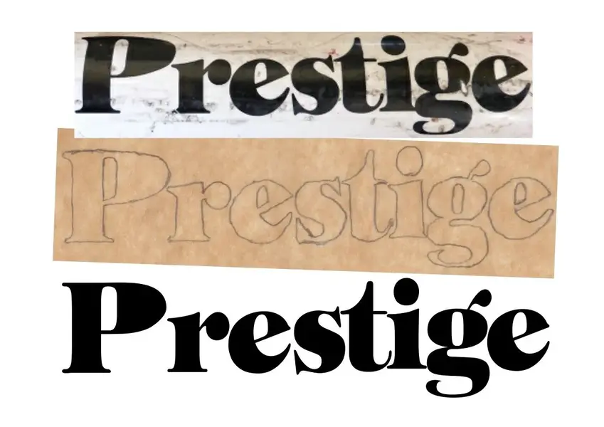
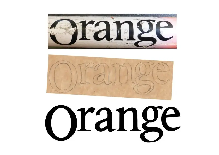
Right so it's taken me a while to get on with these decals but finally found a quiet moment (and some motivation :facepalm: ) to get on with them today. Still not finished (they're a bit rough still, I know) but I've got them a bit closer than before, just a bit of tweaking over the next few days and they'll be done. I traced the main decals then scanned them to use as a template and it's worked out fairly well, pic's show the original, tracing and recreation for each.
 

Attachments

  • Prestige1.jpg
    Prestige1.jpg
    81.2 KB · Views: 639
  • Orange1.jpg
    Orange1.jpg
    69.5 KB · Views: 639
Re:

Nice work there – the Prestige bit especially – it's quite a fiddly job recreating them.

Know what you mean about finding quiet time to yourself – had planned to strip the bike for maintenance over the xmas break but domestic requirements scuppered that pipe dream.

Have you had the frame done yet?
 
Back
Top