- Feedback
- View
You are using an out of date browser. It may not display this or other websites correctly.
You should upgrade or use an alternative browser.
You should upgrade or use an alternative browser.
NEW TI RALEIGH 753 40TH TDF ANNIVERSARY MODEL v.2
- Thread starter IJohnson
- Start date
- Feedback
- View
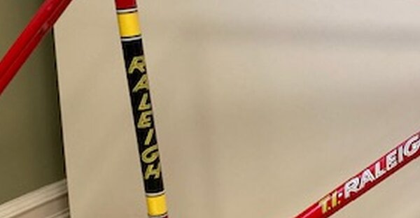
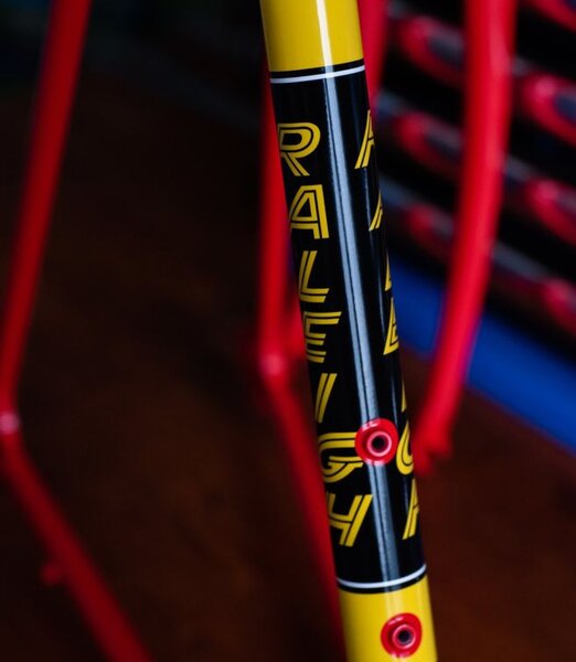
A crappy close up from here https://raleigh-sb4059.com/2014/04/06/t ... ification/
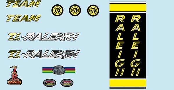
and from https://bicycledecals.net/raleighdecals.htm
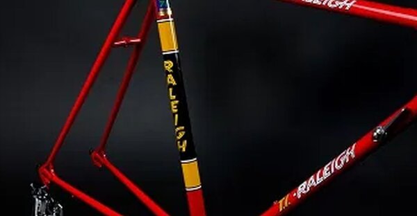
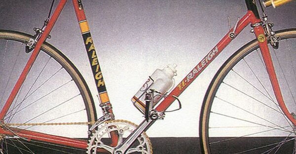
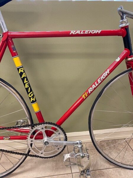
and the real thing
and from https://bicycledecals.net/raleighdecals.htm
and the real thing
Attachments
- Feedback
- View
- Feedback
- View
I can see why H Lloyd may be doing a bit of eye rolling :roll:
vcballbat
Senior Retro Guru
There's three decals that are incorrect on the H Lloyd website :
The complete Ti Team seat tube panel with yellow bands
The Raleigh Europa complete set of decals as this includes the seat tube panel
The Ti Team seat tube decals with yellow letters on clear application backing for painted black panels
__________________________
What's that big grey thing
The complete Ti Team seat tube panel with yellow bands
The Raleigh Europa complete set of decals as this includes the seat tube panel
The Ti Team seat tube decals with yellow letters on clear application backing for painted black panels
__________________________
What's that big grey thing
torqueless
Senior Retro Guru
Re:
If we are being pedantic, I can see that the font on the repro seat tube decals needs a degree more italicising to match the 'originals'.
For example, the 'upright' of the 'R' would appear to be at about twenty degrees from vertical on the repros, and more like thirty degrees on the originals.
Having said that, a look at the picture on p.14 of this thread reveals that the italicisation of the seat tube letters is manifestly less pronounced than that of the down tube letters.. and for that matter, I don't believe that the bike on p.14 has an identical seat tube decal to the one on Joop's(?) bike on this page..
vcballbat
Senior Retro Guru
Re: Re:
I don't think I'm being pedantic, if I am going to entrust my valuable SBDU 753 frame to the experts in their chosen field to supply the decals and re finish my frame I am relying on their professional knowledge to get this done correctly, so that my frame looks correct when placed next to an original. With quotes from £300-400 its a bitter pill to swallow if it turns out wrong like the vast majority that I have seen on the market, some selling on eBay for over £1500... it's becoming a bit of a joke.
What next....will they get their own class at next year's Eroica.... :facepalm:
So no...I don't think I'm being pedantic...I just want to see an end to this farce and to protect fellow Retro biker's from making this very expensive mistake... isn't that the whole ethos of this brilliant website..?
utorqueless":fyuv3gk2 said:If we are being pedantic, I can see that the font on the repro seat tube decals needs a degree more italicising to match the 'originals'.
For example, the 'upright' of the 'R' would appear to be at about twenty degrees from vertical on the repros, and more like thirty degrees on the originals.
Having said that, a look at the picture on p.14 of this thread reveals that the italicisation of the seat tube letters is manifestly less pronounced than that of the down tube letters.. and for that matter, I don't believe that the bike on p.14 has an identical seat tube decal to the one on Joop's(?) bike on this page..
I don't think I'm being pedantic, if I am going to entrust my valuable SBDU 753 frame to the experts in their chosen field to supply the decals and re finish my frame I am relying on their professional knowledge to get this done correctly, so that my frame looks correct when placed next to an original. With quotes from £300-400 its a bitter pill to swallow if it turns out wrong like the vast majority that I have seen on the market, some selling on eBay for over £1500... it's becoming a bit of a joke.
What next....will they get their own class at next year's Eroica.... :facepalm:
So no...I don't think I'm being pedantic...I just want to see an end to this farce and to protect fellow Retro biker's from making this very expensive mistake... isn't that the whole ethos of this brilliant website..?
torqueless
Senior Retro Guru
Re:
I think first you have to assure yourself that there was indeed a consistency about the original transfers.. over what? ten years?.. that there was a definitive font, size, italicisation and placement... and anything else you can think of. If you know exactly what you want, I guess you can ask for it?
We've already seen that Raleigh themselves, for whatever reason, seem to have accurately reproduced neither their own transfers nor their placement?
Similar threads
- Replies
- 9
- Views
- 505
- Replies
- 11
- Views
- 5K
- Replies
- 18
- Views
- 4K
- Replies
- 9
- Views
- 2K
- Replies
- 289
- Views
- 45K
