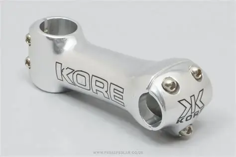
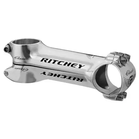
Extreme component branding practices...

That's left every walk of life. Cars have to have massive design features common to the entire lineup, like BMW's latest massive buck toothed grill setup that's a far cry from what it was even ten years ago. Apparently the Chinese like bold design features. Bold isn't always classy, or actually good. Look at the jump of Balenciaga from its origins as elegant design to today's garbage aimed at people pretending to be gangsters or rappers. Expensive garbage, but garbage nonetheless!

Kids these days eh?😆

Oh, hold on, I remember people saying that to me a few decades ago🤔
 
New Yeti has small logos, my SB5 has a stealth logo. In the other hand, el S Works ans Specialized had a big logo since 90s and now are more stealth. So it is the same more less, I don’t buy too much carbon so …

Look this Meta, nothing new. HED and spinergy and the tioga disc drive wheel etc has big logos in the 90s
 

Attachments

  • 04D19E1C-6EA1-424B-AFD4-227129A716C0.jpeg
    04D19E1C-6EA1-424B-AFD4-227129A716C0.jpeg
    60.5 KB · Views: 7
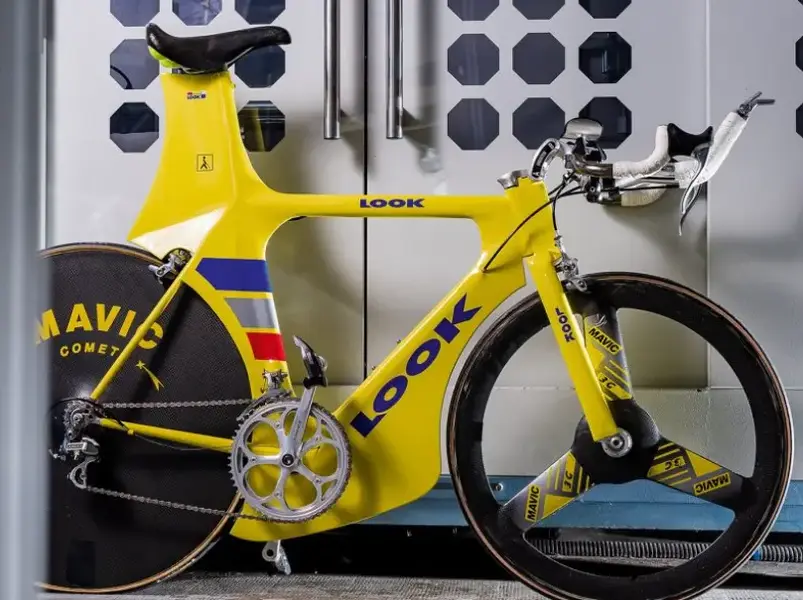
Ha, but, BUT, Greg Herbold was a racer so he needed to make his bike stand out to satisfy the sponsors, its not like your average Mercedes is being bought off the forecourt covered in the same logos as an F1 car.

You compared a boring hybrid from a boring brand to a one-off racer's bike, this is a better comparison (and the logos are bigger!):

[ 1737570658686.png

I see you and raise you (from 1996)

1737570586453.png
 
At least the early to mid 2000's thing of everything being some combination of red, white and black died off. That was definitely Specialized. The bicycle equivalent of a fecking Man Utd shirt. :)
 
At least the early to mid 2000's thing of everything being some combination of red, white and black died off. That was definitely Specialized. The bicycle equivalent of a fecking Man Utd shirt. :)
My 2000 Spesh S-Works FSR XC was a white, red and black fever dream: red RF cranks, red stem, white bars, red grips, red forks. At least the rims and tyres were all black but it really was, objectively extremely ugly. Rode well though!
 
I have long believed that 'aero' rims are not actually very aero at all and especially with the de-rigeur enormous tyres everyone wants to ride - they do however provide an enormous marketing and branding space compared to non aero rims, older rim brake rims :)

Are you interested in some Nisi tubular rims? There's fcuk all room for a brake block never mind a sticker.
 
Hard to believe you could even fit a tyre on them -
The era when Less was More.

Now More is More🙄

Oh my god. Those rims with concave sides of absolute nothingness.

You could always tell which rims were used for track or TT or road simply looking at the un-shredded or very shredded centre sticker edges.
 
Back
Top