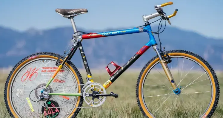
Extreme component branding practices...

Terrible rant. 2/10.

How is large branding any different to the dayglo bikes/clothes/geegaws of the 80s/90s.

"we need a gimmick!"

:D

I'm interested in when it started and why - there are material changes, but also commercial factors at play.

Its definitely the case that there's more of it now than 30+ years ago - and look at the top bikes of the 1950s - discretion and taste, as a rule.

So will it fall out of fashion, or just keep getting bolder and bolder?

Save me from the black-on-black smug marketing style too
View attachment 919816
A development of the
bike-thief-rattlecan-black
of the (in)appropriately named
BadBoy🙄

Tbf to 'Dale and the "black on black" they are reacting to "megabranding", but it's tongue-in-cheek and to create a buzz and column inches.

They were early adopters and still massively on it.
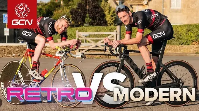
 
I'm interested in when it started and why - there are material changes, but also commercial factors at play.

Its definitely the case that there's more of it now than 30+ years ago - and look at the top bikes of the 1950s - discretion and taste, as a rule.

So will it fall out of fashion, or just keep getting bolder and bolder?


Tbf to 'Dale and the "black on black" they are reacting to "megabranding", but it's tongue-in-cheek and to create a buzz and column inches.

They were early adopters and still massively on it.
Tom has an opinion that covers that too:

"Aluminum started the big billboard. Cannondale made the entire industry insecure. Cannondale gave everyone a heart attack in the 80's because they had the biggest billboard, the biggest name, and no one had a name that big. You could create a light bike with a billboard that big"
 
Up to the (mid?) 90s, branding of cycles was reasonably discreet, and tended to stick to the major parts.

The frame decals would probably be less than a quarter of the tube diameter, a discreet postage-stamp label on the rims, tidy shimano logo with groupset level name on the major components.

I don't think anyone is saying it didn't exist before 95 - just that gaudy paint and huge decals were a rarity.

I call your bluff.
 
And I was trying to compare a page of catalogue from 1994 with 2024... until I discovered they don't do catalogues anymore🙄🤣
 
Discretion and taste, as a rule.
That's left every walk of life. Cars have to have massive design features common to the entire lineup, like BMW's latest massive buck toothed grill setup that's a far cry from what it was even ten years ago. Apparently the Chinese like bold design features. Bold isn't always classy, or actually good. Look at the jump of Balenciaga from its origins as elegant design to today's garbage aimed at people pretending to be gangsters or rappers. Expensive garbage, but garbage nonetheless!
 
I call your bluff.
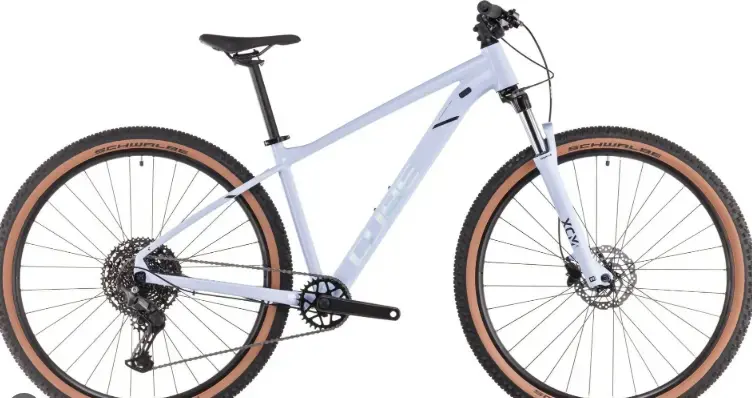
Ha, but, BUT, Greg Herbold was a racer so he needed to make his bike stand out to satisfy the sponsors, its not like your average Mercedes is being bought off the forecourt covered in the same logos as an F1 car.

You compared a boring hybrid from a boring brand to a one-off racer's bike, this is a better comparison (and the logos are bigger!):

1737565575194.png
 
Back
Top