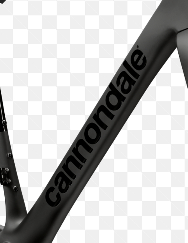
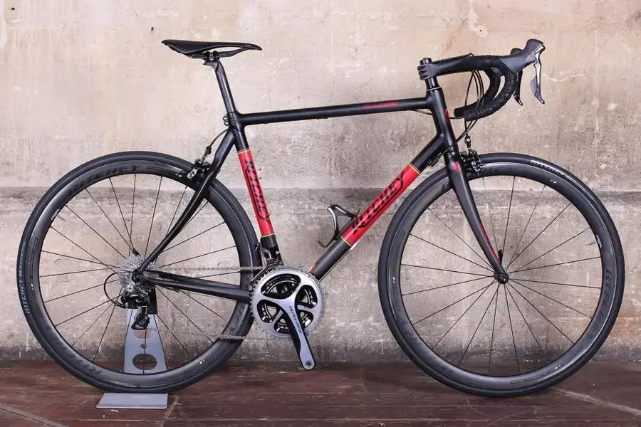
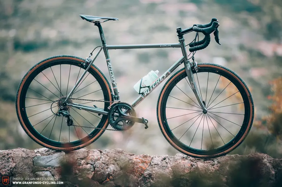
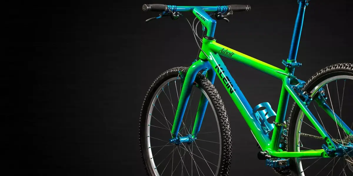
Extreme component branding practices...

I thought the curly/ flying gate/ cantiflex/Paris frames of the 40s and 50s were used (mostly) because the manufacturers wanted to make their frames visually distinctive on the race track?
Otherwise let's face it its' a gimmick.
(Altho im a curly owner😉)

The rise of TV sport and multinational branding has demanded greater "bike area" to advertise on.
And clothing - cricket in particular, but football and rugby, cycling of course...

I'm reminded of Raphael Nadal in a tv interview removing the carefully placed bottles of coca cola and replacing them with water👍
I would love to see a peloton full of curly/flying gate/cantiflex and paris frames though. This is the other side of design, it can be pleasing to the eye, recognizable and ultimately iconic.

Not sure if the huge graphics will ever become iconic.
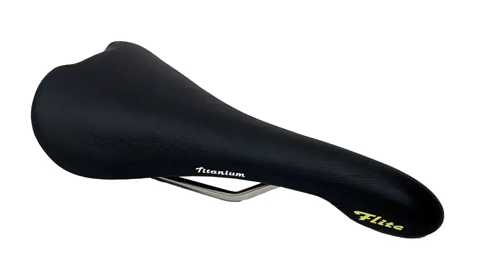
 
I blame the 1990s.

1987 Ti Flite:

flite 1987.png
1998 Gel Flite:

flite 1998.png


In terms of the big branding on frames and parts, haven't we actually gone back to the more minimalist aesthetic now, after the garishness of the 90s and 2000-2015ish era (I think the 00s was the probably the low point in terms of horrible graphics)?
 
I'd hate to take issue with TR, but I'm not sure he's talking about the design requirements of modern race bikes.
(Which is where the marketing people want to lead us)

A larger diameter tube delivers more stiffness, and so greater strength and efficiency, for a given amount of material.
(Although you can't drop your keys on it!🤣)

Narrow tubed composite frames would be wobbly or heavy or both.
I don't think there's a market for that any more.

But the "designing in a billboard" idea is bang on.
IMG_1107.jpeg
IMG_1105.jpeg
To be fair to TR, he did put his hands to work to almost prove his point.
 
Terrible rant. 2/10.

How is large branding any different to the dayglo bikes/clothes/geegaws of the 80s/90s.

"we need a gimmick!"*

:D


*Shout out to nekrogoblikon...
 
Back
Top