Top Image Neptune E-stay

Elfman

Bontrager Fan
I know what you're thinking....does this guy have a real job, or does he just paint and rehab bikes all day long? My lethargy in bringing along my Bontrager Race Lite build should give you a hint.....I'm a weekend warrior like the rest and best of us. And, yes, I have been simultaneously working on this build and my Kestrel CSX, but only because I'm trying to be efficient with my sanding, priming, and painting process. (Isn't this what Henry Ford taught us?)

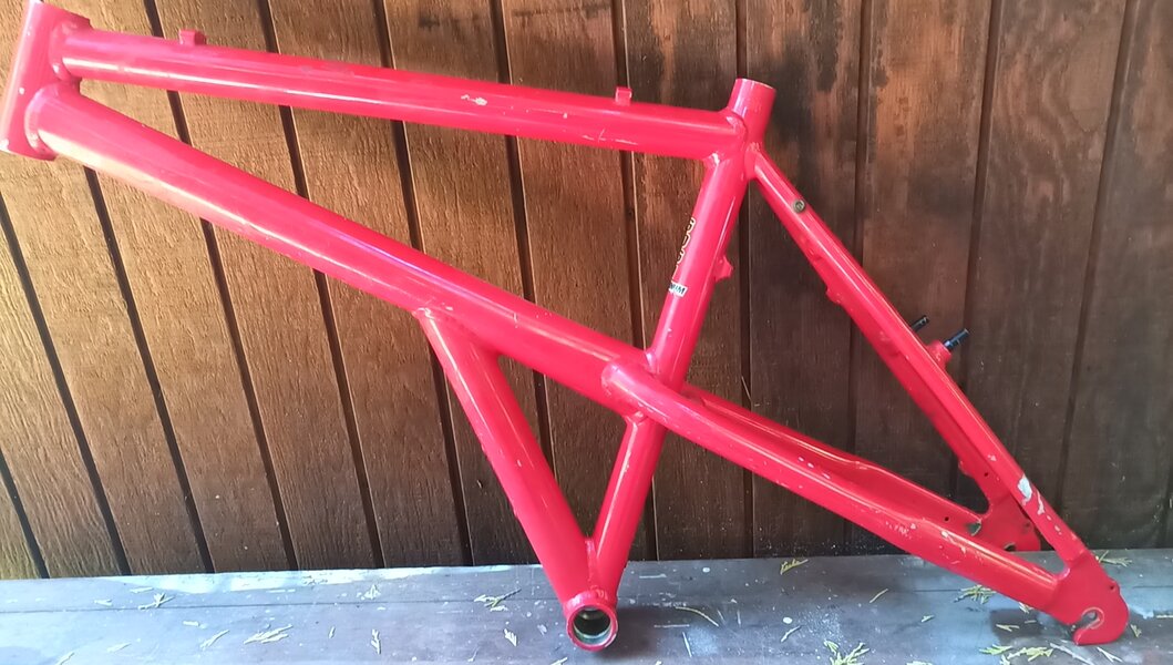
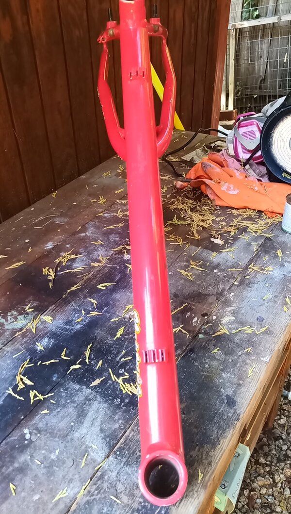
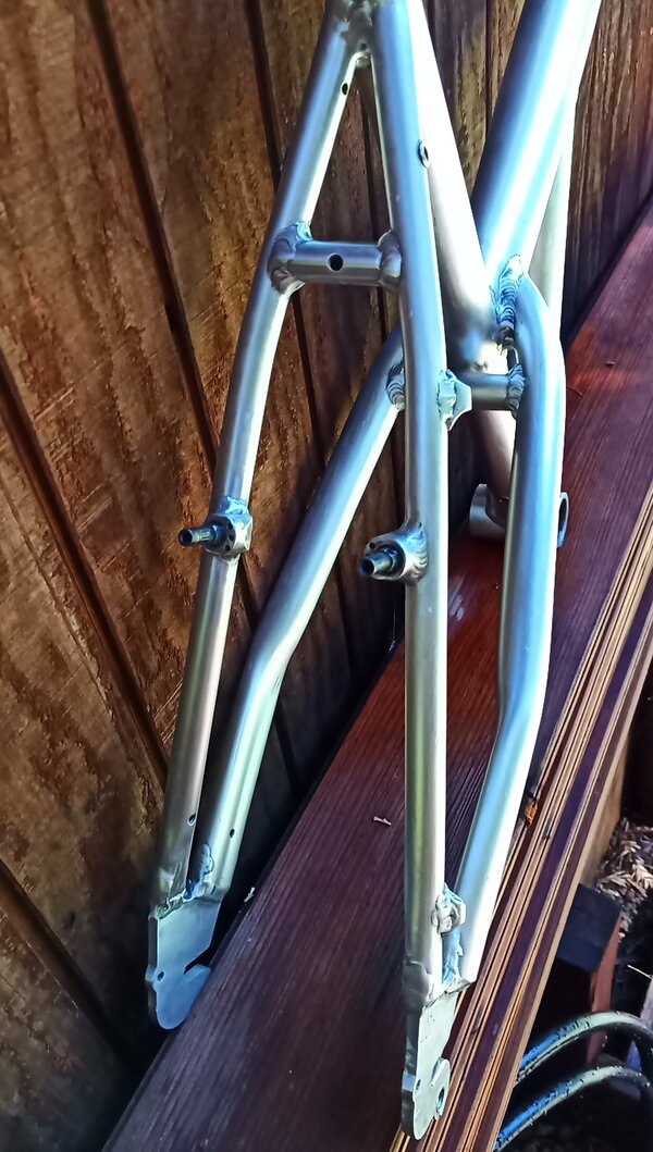
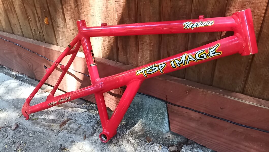
Anyways, I acquired this frame for dirt cheap last year, around the same time I acquired my Kestrel CSX. Like the Kestrel, this frame was pretty trashed, a rather ugly color (a very orangey red), and of curious provenance. (I was not searching for a Top Image frame, and I don't remember how I came across this bike in my searches, but it was an e-stay. And for those of us e-stay enthusiasts...well.....need I say more?) So, a rather curious incarnation of the e-stay craze wound up on my doorstep. BTW, I have no idea what year bike this is, but given that it is an e-stay, and my plans are too paint it in wildly bright colors with plenty of early 90s purple sh$% hanging on it, I'm putting it here in the pre 1997 forum. But admins, feel free to move it if I goofed this up.

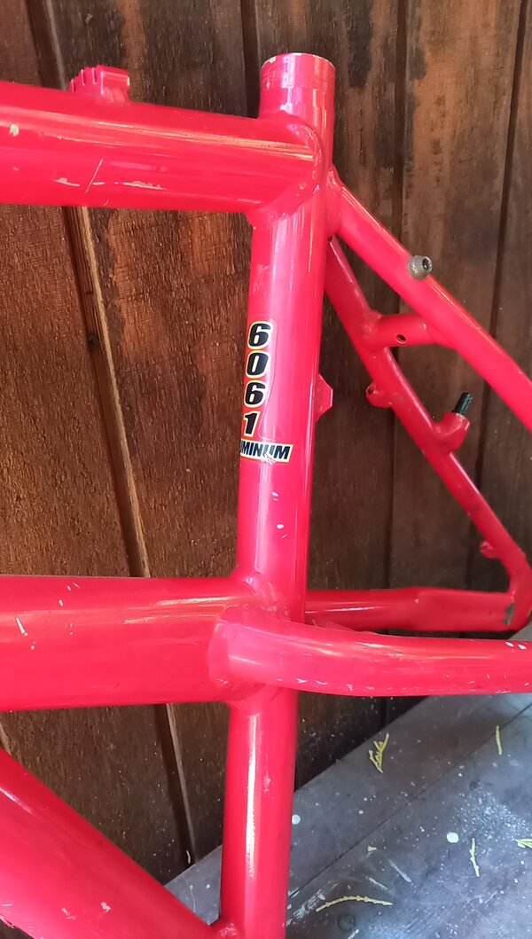
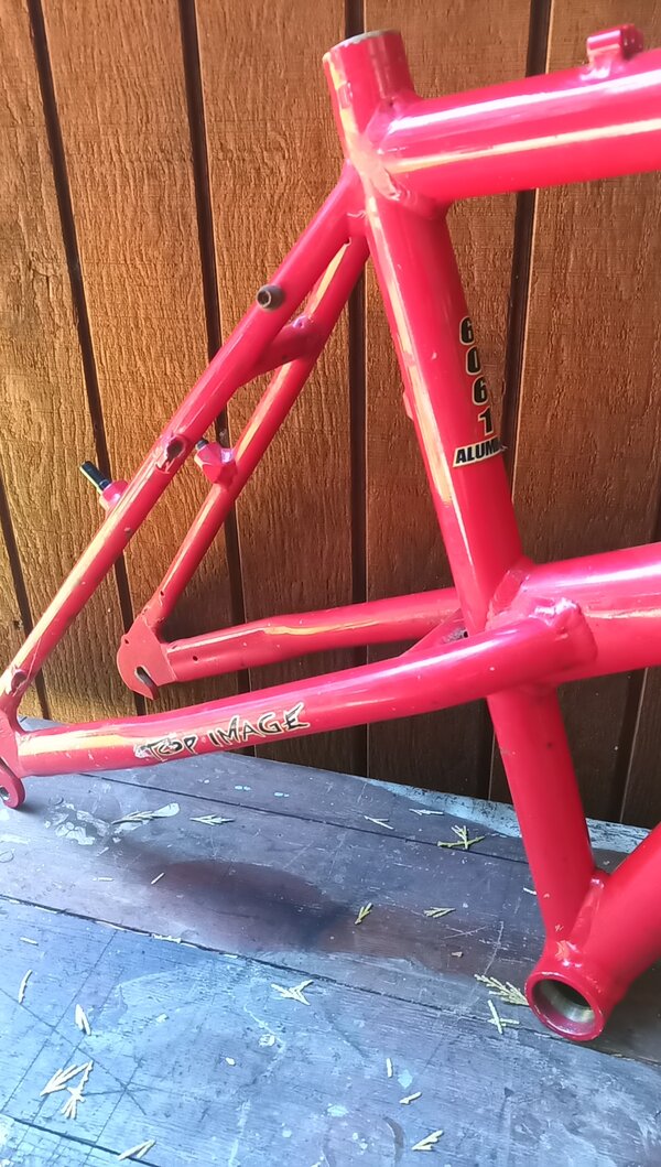
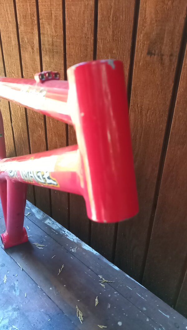
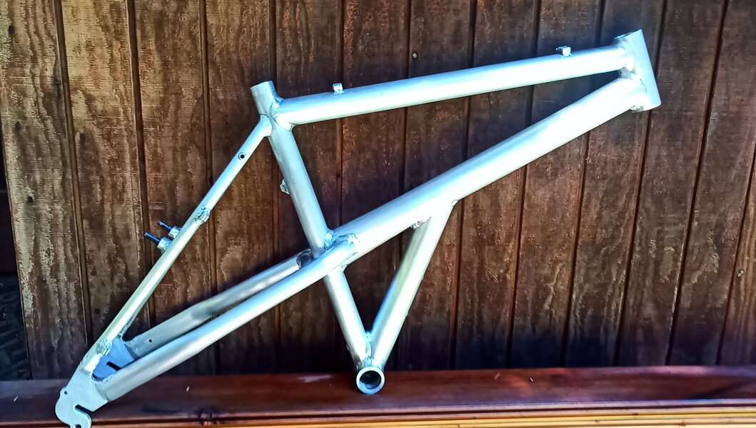
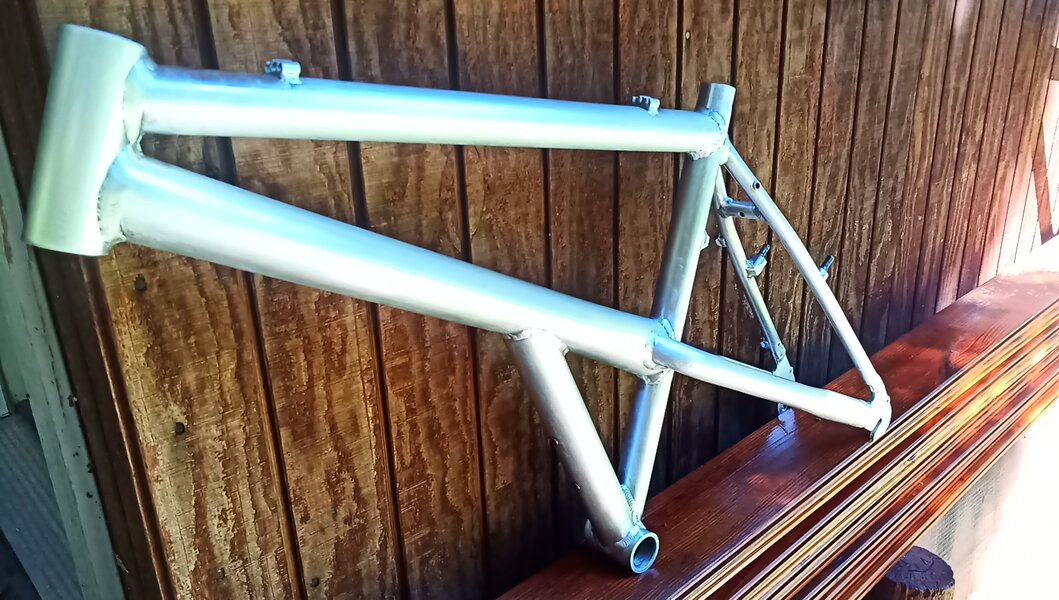
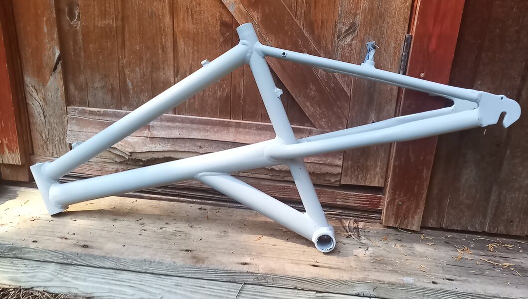
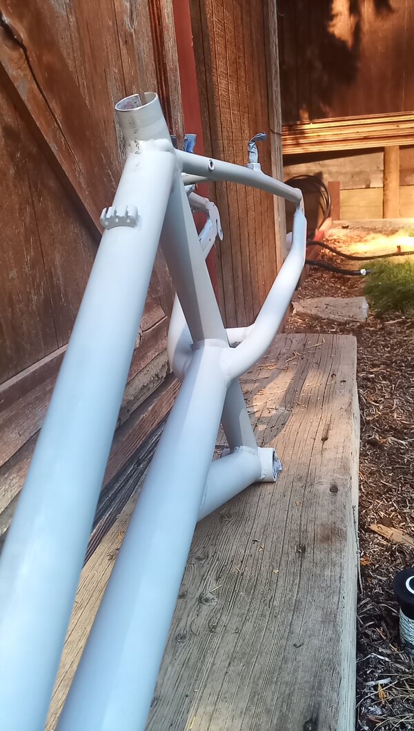
Here's the frame:
IMG_20220619_140708_0.jpg

IMG_20220619_140749_3.jpg
 
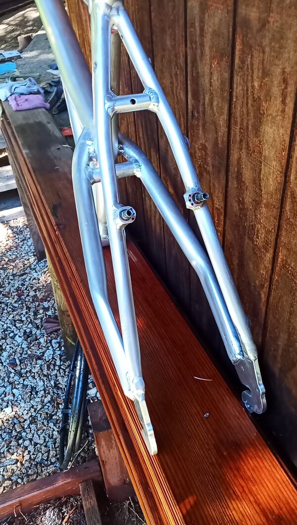
This frame is a little bigger than my others, but not too oversized for my standover and height, so should work fine for me. It is about 18.5" c-t. 1-1/8" headtube, top-routed cables....things could be worse. I hemmed and hawed about what colors to paint this frame for almost a year before I zeroed in on a fade. Again, I'm doing this on the cheap with rattle cans, so my options had those limits, but I wanted to do something akin to the Klein fade (back to front, not "linear fade") that incorporates hot pink, purple, and blue. But I'd find my own hues of those colors and make it my own. And no offense to the chinese frame builders at Top Image, but I found that namesake so utterly cheesy and contrived from the 90s (and possibly suffering from some translation indulgence?) that I am abandoning the idea of reproducing the decals or even using that brand name. I'll retain "Neptune" as the model name, but I've always wanted to name something based on one of my most favorite places on earth: Bright Dot Lake in the Sierra Nevada Mtns of California. So, this is the adage that will adorn my downtube: Bright Dot. But, I'm getting ahead of myself....let's talk about refinishing the frame first....
 
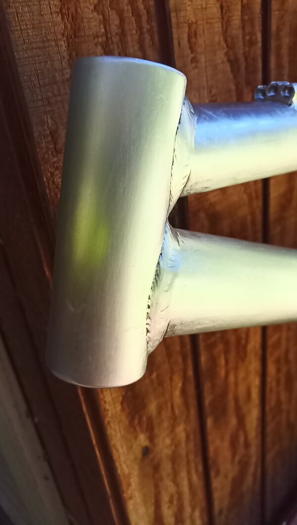
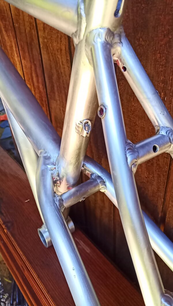
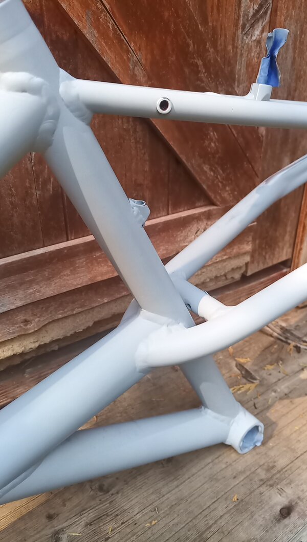
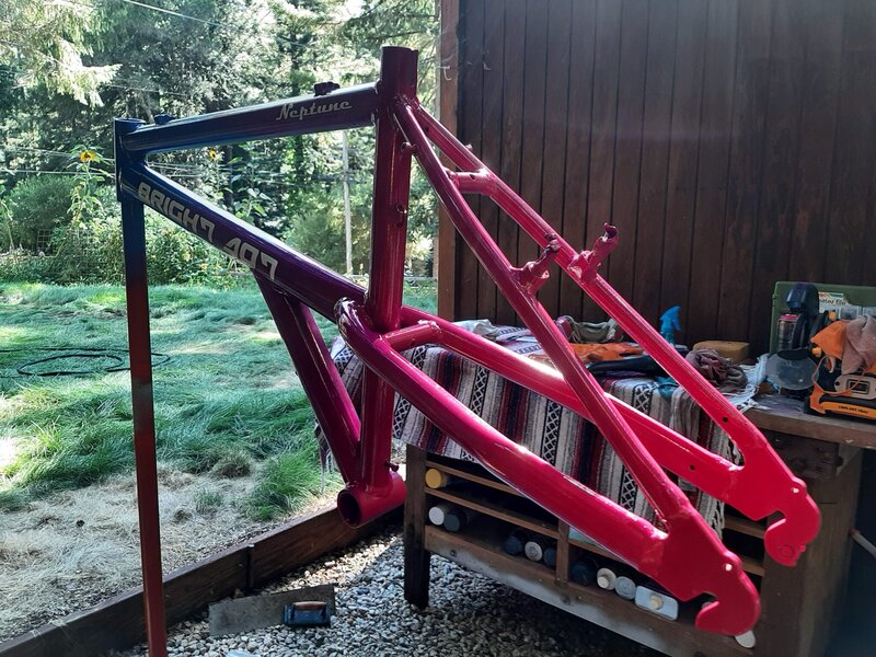
Firstly, let's remove the paint. Multiple treatments of Jasco's with various wire brushes, rags, and swear words relieved the frame from its ugly shackles. The welds are ugly (what do you expect for an e-stay knock-off from China?), but in applying my dremel with a wire-wheel attachment not only cleaned out the old paint from the cracks and crevices, but it knocked some of the excess sloppiness from the welds and smoothed them out a bit. I was careful not to knock too much off, as I don't want to compromise the welds. But it was a nice side-effect of removing the old paint.

IMG_20220626_153501_8.jpg


IMG_20220626_153510_0.jpg


IMG_20220626_153743_3.jpg
 
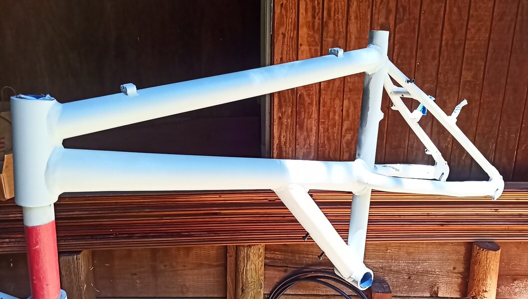
There was a lot of phases to this, and I'm oversimplifying the work involved, but lots of sanding, rinsing (with water or acetate), buffing, and plain ol' experimentation with various means to prep the frame, smooth out imperfections, and get it ready for primer and paint. Here's some more pics:

IMG_20220626_153752_2.jpg

IMG_20220626_153814_8.jpg


IMG_20220626_153821_4.jpg


Those e-stay tubes and welds made for some fun sanding, let me tell you. ;-)
 
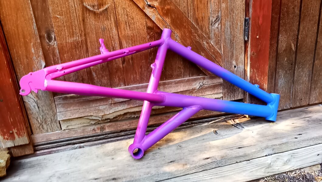
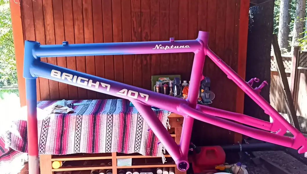
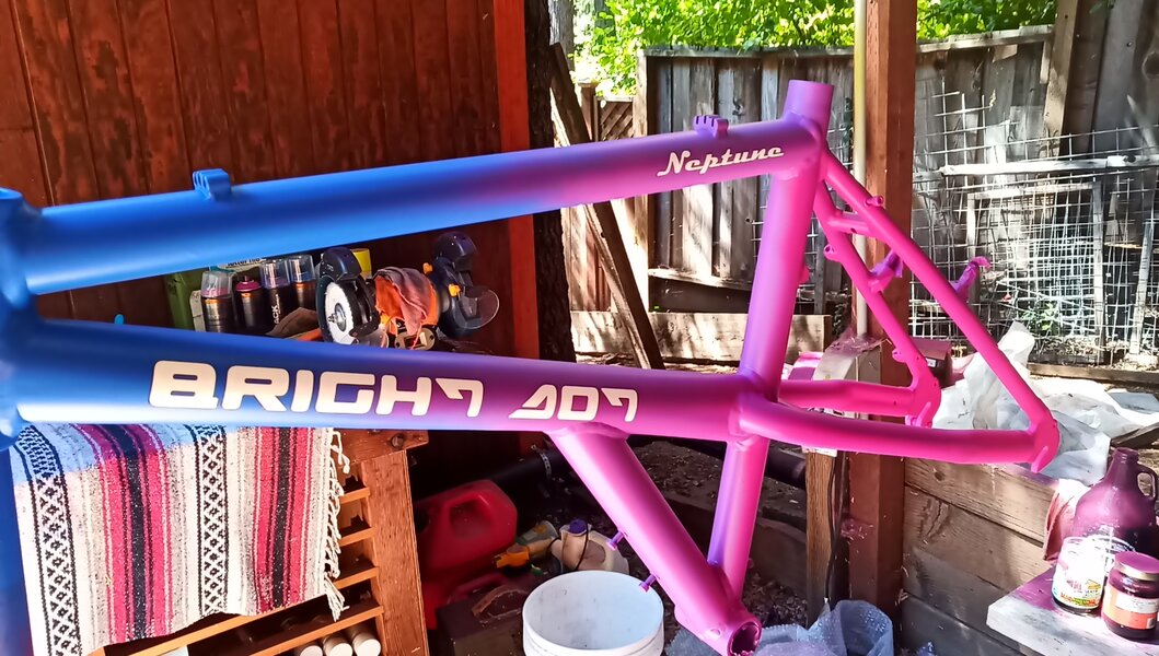
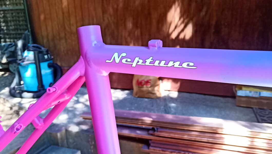
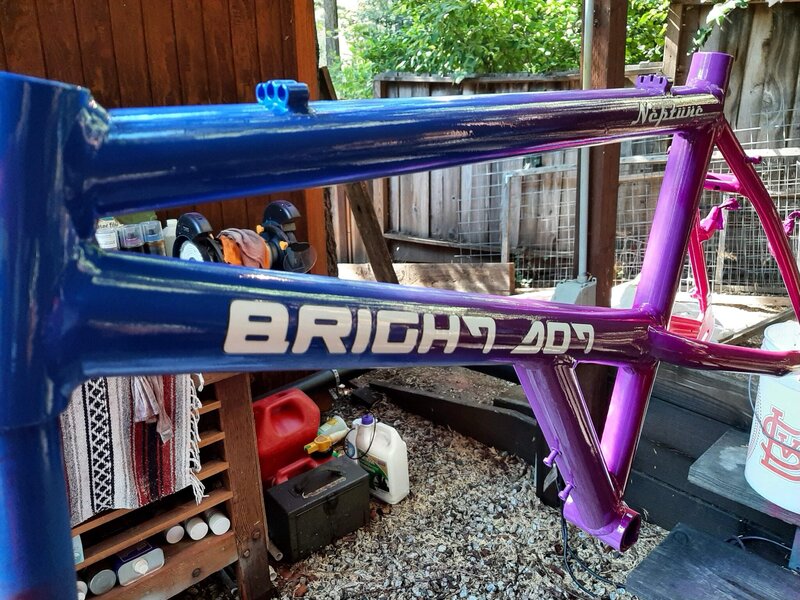
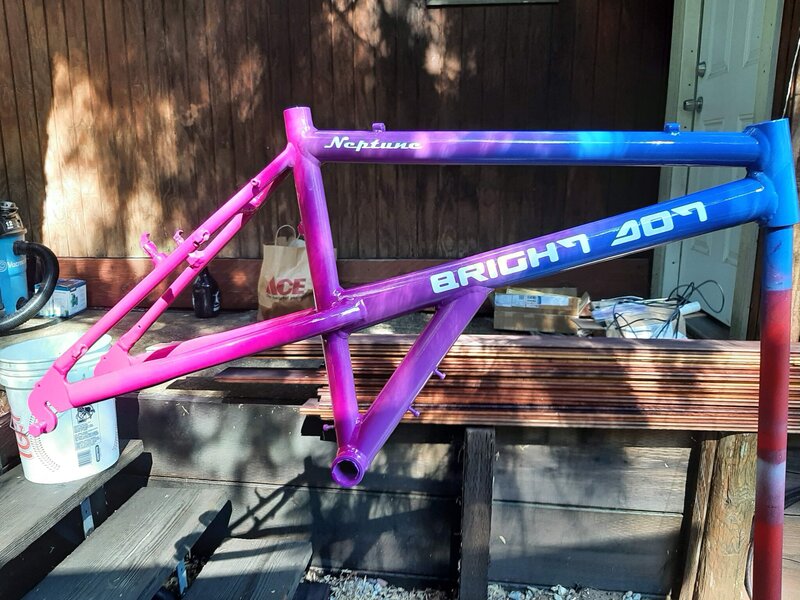
And now for the first treatment of paint. I ended up selecting a 4-tone fade, using Montana Cans Black paints, in the four following colors: Knock Out Blue, Monster (a purple hue), Good Times (a brighter purple hue), and Freak (a bright flouro pink color). Given that I'm a totally novice painter, I'm quite happy with how the fade turned out. My camera sucks and colors don't come out tremendously well, but the colors are more vibrant than in the photos. The pink at the rear dropouts is pretty bright....not Klein flouro bright, but pretty close and at a fraction of the price.

IMG_20220814_171931_5.jpg
 
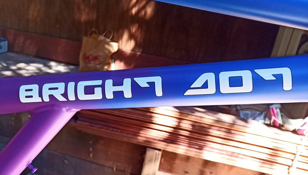
I put the decals on today. I chose the lettering design for both and the color scheme, and decided to name this contraption "Bright Dot". Decals from Lettering.com. These do not require water to activate the glue (like the ones from Velocals), so they're a little easier to put on. Die cut vinyl, and very nice quality. Next comes the clear coat, since these decals don't need to cure for 24 hours.

IMG_20220821_144837_7.jpg


IMG_20220821_144848_0.jpg


IMG_20220821_144857_0.jpg


IMG_20220821_144902_3.jpg


IMG_20220821_144908_1.jpg
 
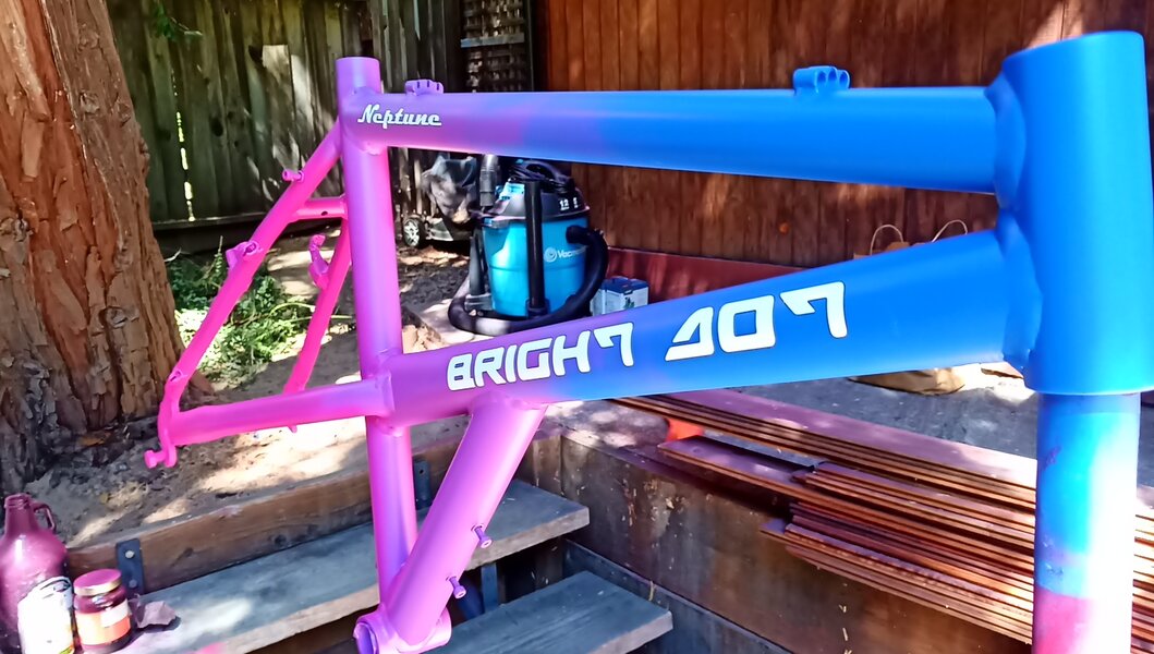
Clear coat on. SprayMax 2K clear coat, rattle can. I went heavy, thinking I might be able to get away with no second coat. Alas, I had a few runs, and a little orange peeling, so I'll have to let this cure and then hit it with a little wet and dry and give it a second coat. But it came out pretty nice. Using my wife's phone here, with a much better camera that shows the hot pink a little better at the rear dropouts. It really pops with the clear coat on now!

20220821_161121.jpg


20220821_161104.jpg


20220821_161036.jpg
 
Back
Top