Ti Raleigh Seat Tube Decals.. The Definitive Guide To The Correct Team Livery

Wow, that's the original paint and decals... looks to be in really great condition but looking at your stunning past builds I can see you are striving for excellence. Looks like a Time Trial Special with braze on cable guides for Weinmann 500's..👍
The paint was in a bad way when up close so decided to go the repaint route & having not seen the frame I’m sure all is OK well I’ve seen the Argos link & looks good….🤞🤞

This may not get built up for some time…
 
Last edited:
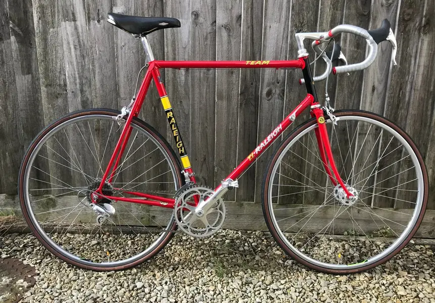
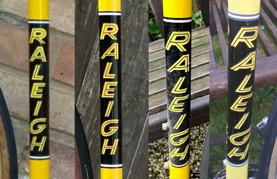
The incorrect seat tube decals have have definitely been around since 2011 having seen them used on documented restorations. Around about 2017 the seat the decal was tweaked slightly, I say slightly because only the letter A was altered, the rest of the letters being the same more upright font as before. This slightly tweaked version completely fooled many into thinking that it's correct, it's far from being correct and in my opinion looks even worse than before as with just the A altered it sticks out like a sore thumb..👎

IMG_3093~2.jpeg
 
Last edited:
Ohh...I feel another montage coming on.. let's take a closer look..🧐

First up is the old incorrect version with it's upright font..

Next up is the 'Sore Thumb' version which we can clearly see that only the letter A has been altered the rest is the same as the first picture.. it's completely wrong and was NEVER used used by Raleigh in the Ti Team Livery..👎

Next up is a genuine original seat tube decal from 1980..

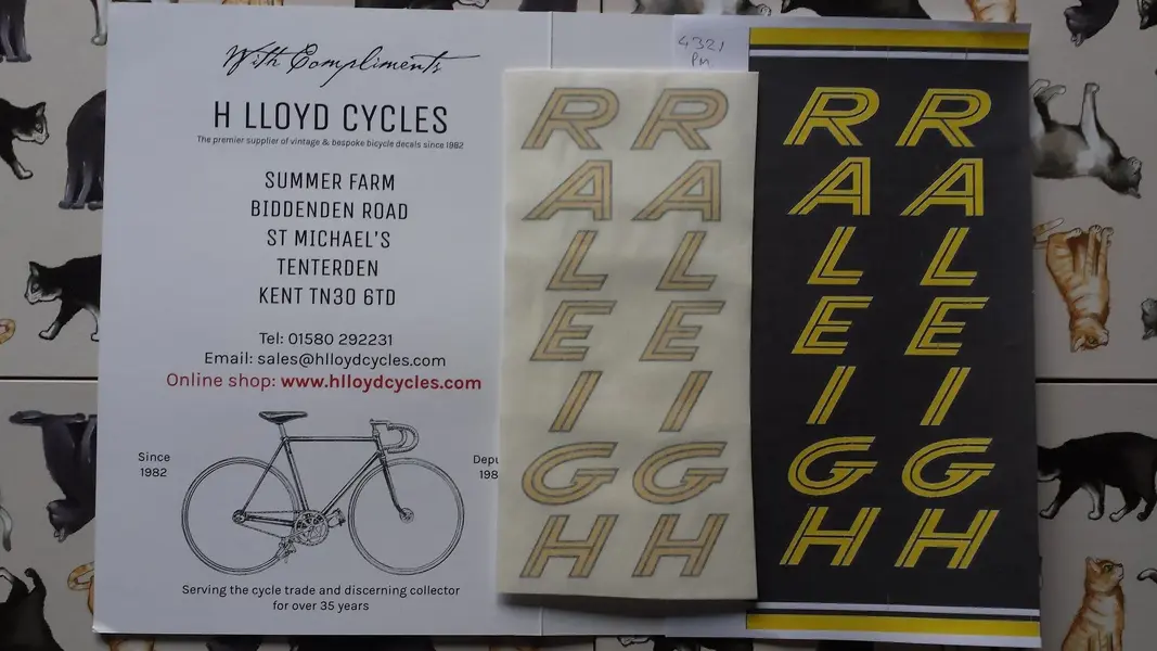
And finally the new version from H Lloyd Cycles..

ZomboDroid 26012022003249.jpg
 
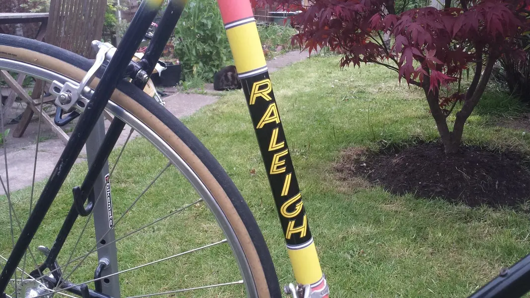
The new version next to the original artwork by torqueless and then applied to my Raleigh Team Professional..☺

20210620_085612.jpg 20210508_182734.jpg
 
  • Like
Reactions: Nob
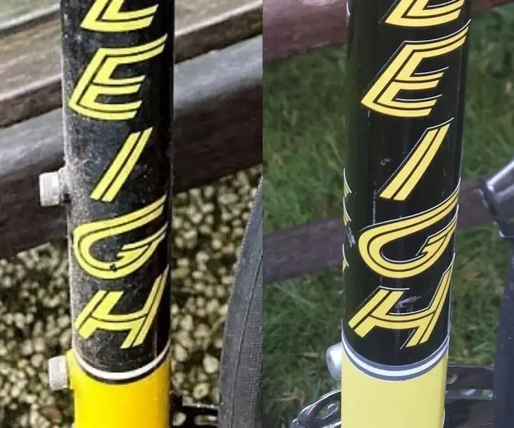
Hi, although I applaud all the effort that folk have put into these new decals I think the "ghost" white edging around the letters spoils the effect. Maybe it's the thickness of the vinyl or the fact that the decals are printed on white backing and the edge of the cut is visible when applied - I first noticed it on my H Lloyd Selbach decals when applied onto a black frame, but on my Paramount decals it wasn't visible as the frame colour was silver.
Just sayin'.
Regards
Tony
Yes I have heard of this issue and that you can touch this in prior to lacquer. Using a full panel seat tube decal with the yellow and white bands will not be affected by this issue. Full panels are available with different widths of yellow or can be customised to your width requirements just contact Steve directly by phone.
 
Hi, I think that in the case of the Raleigh letter decals the best solution would probably be to print on black vinyl if that's possible, would you really expect people to pay good money and then have to touch up the edges of the letters to make them look right? I was certainly a bit disappointed with my Selbach ones - but there's not a choice of supplier.
Even after lacquering there's still a noticeable step due to the thickness of the vinyl that holds polish residue and enhances the ghost white.
This is not really a good look when compared to the original on the left. I can't be the only one who's noticed it.
 

Attachments

  • ZomboDroid 26012022003249.jpg
    ZomboDroid 26012022003249.jpg
    92.6 KB · Views: 6
Back
Top