- Feedback
- View
Re: Mountain Mayhem Race Jersey thread
Or just an opinion.
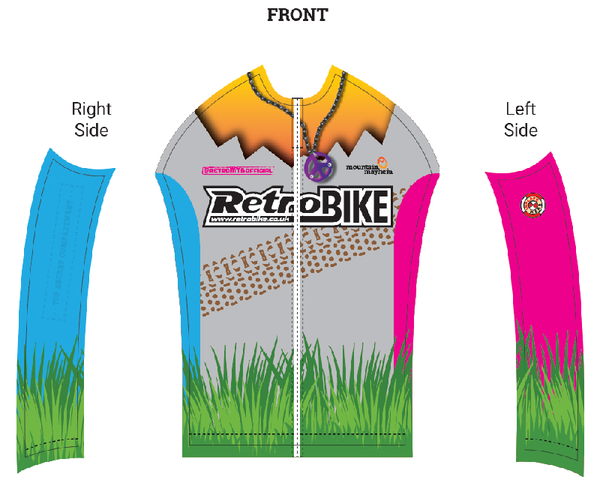
I think the retrobike logo should be more prominent, forming the background to the overall aesthetic. Maybe on its side down the middle of the back.
Or just an opinion.
I think the retrobike logo should be more prominent, forming the background to the overall aesthetic. Maybe on its side down the middle of the back.

