Guinessisgoodforyou
rBotM Winner
I see your ugly Trek, and raise you this Pinarello (from 2006). One of the ugliest bikes ever made in my opinion (and continuing the red, black and white theme).
View attachment 920231
That's awful.I see your ugly Trek, and raise you this Pinarello (from 2006). One of the ugliest bikes ever made in my opinion (and continuing the red, black and white theme).
View attachment 920231
If I look at it for more than a few seconds, I feel slightly nauseous.That's awful.
Why did someone not check both the wheels and crank were in the correct position prior to taking the photograph?

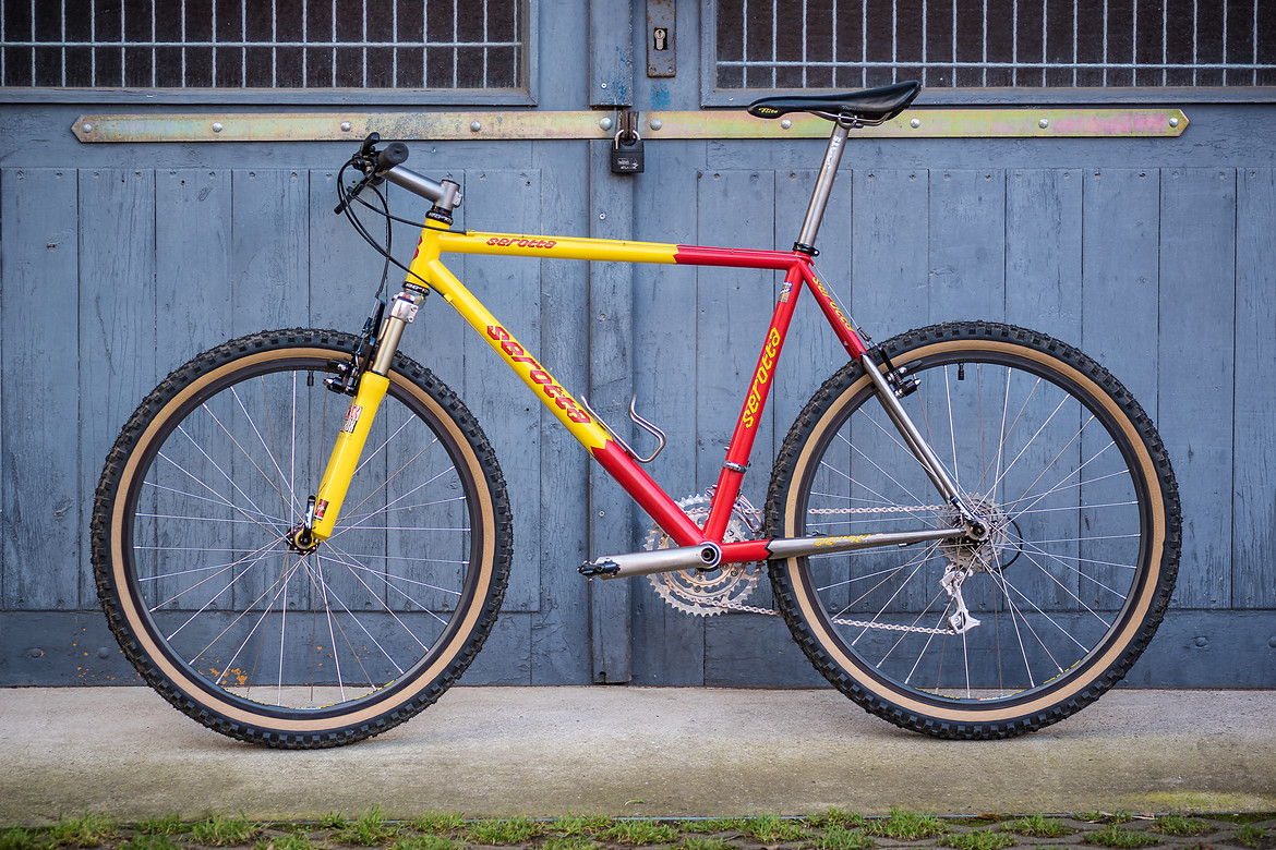
Wow. If Craaaiig Daaavid was a bike, this is the bike he would be.I love this bike but it was pretty funny when someone pointed out that Ben managed to put his name on every tube of this frame

A lot of brand names on a bike makes it look like a race bike. Same with race cars and all the sponsor logos.
Back in my youth that was a cool look. Magazines came with sticker sets.
Now that I'm older I prefer understatement.