Brodie Sovereign

Re:

shauno":1jvhx8h5 said:
So what happened here Frank?
Is it finished ?

I love bringing old threads back ;)
No, still sitting here unfinished right next to the Thunderbolt which also needs some final touches. :roll:

i had promised myself that I would get to stripping and repaint this summer. but this season was a bust for me with respect to moving forward with any of my outstanding projects. everything pretty much grounded to a stop once i had my reproduction decal artwork printed up. :(

on the positive side, there are plenty of build threads of mine (mostly finished or with a few minor changes in mind) that you can revive if you have a look! :LOL: ;)
 
time to revisit this one. maybe this year i'll get around to the strip and paint i want. :roll: :facepalm:

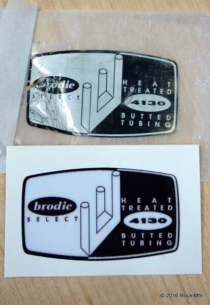
in any case, i'll eventually need a replacement tubing decal. so here's the first test print. not sure why i didn't gang this with the big sets of decals i printed last year. perhaps thinking it's only black on white, it should be an easier, more economical path for this one later on.

well, this isn't perfect, but it's acceptable. of course it could be improved on. being digitally printed, it isn't as sharp as the original screen print, but you really have to get up close to see that, under a foot or so i would say. any further and it looks fairly clean.

gonna have some more tests done, select thinner vinyl stock, perhaps brighter white, tweak the die-cut trim, and perhaps tweak the printed black tone.
 

Attachments

  • DSC02887.JPG
    DSC02887.JPG
    121.5 KB · Views: 686
Good skills Frank :)
 
Re:

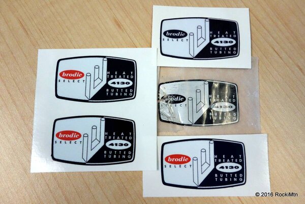
second round of test prints. don't ask me why/how the logo got turned to red, as they were only supposed to adjust the colour saturation of the black. :facepalm: though it looks pretty nice that way. :roll:

thinner laminate also applied so overall thickness should be less. the black is much better on the new print compared to the first one at the top right. two on the left is also much better with slightly richer black compared to the bottom right.

hopefully will have a batch of finished decals next week. :cool:
 

Attachments

  • DSC02966.JPG
    DSC02966.JPG
    143 KB · Views: 558
Looking good Frank :)
 
Re:

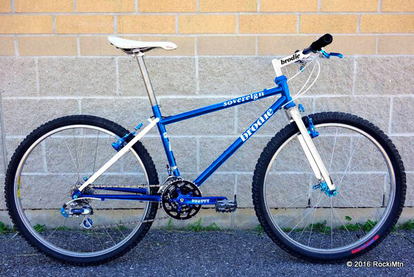
decided i should do a visual mockup of the frame colour scheme again. this time on the correct bike frame and final components to confirm this is indeed the path i want to take.
 

Attachments

  • sovereign-mockup.jpg
    sovereign-mockup.jpg
    103.4 KB · Views: 469
Re: Re:

RockiMtn":1obf126k said:
decided i should do a visual mockup of the frame colour scheme again. this time on the correct bike frame and final components to confirm this is indeed the path i want to take.

Love it :cool: The one thing standing out for me is the ti syncros post... I'd be keen to see how it looks with a regular black alu one...
 
Back
Top